Designing for Community Empowerment Activists
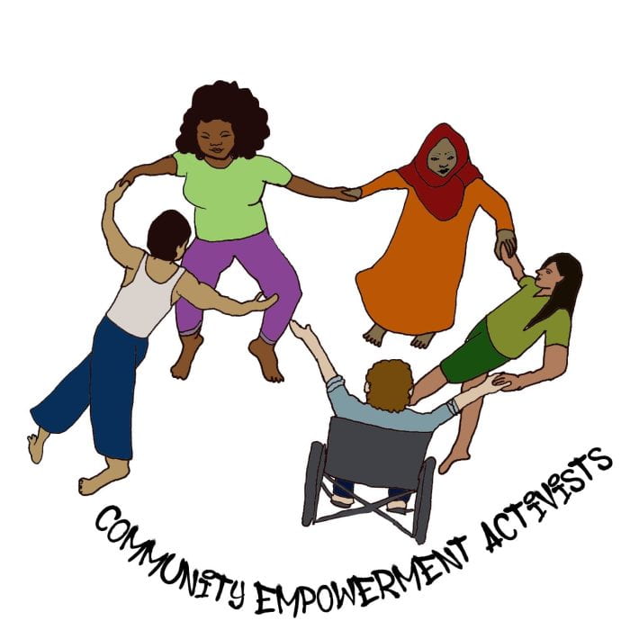
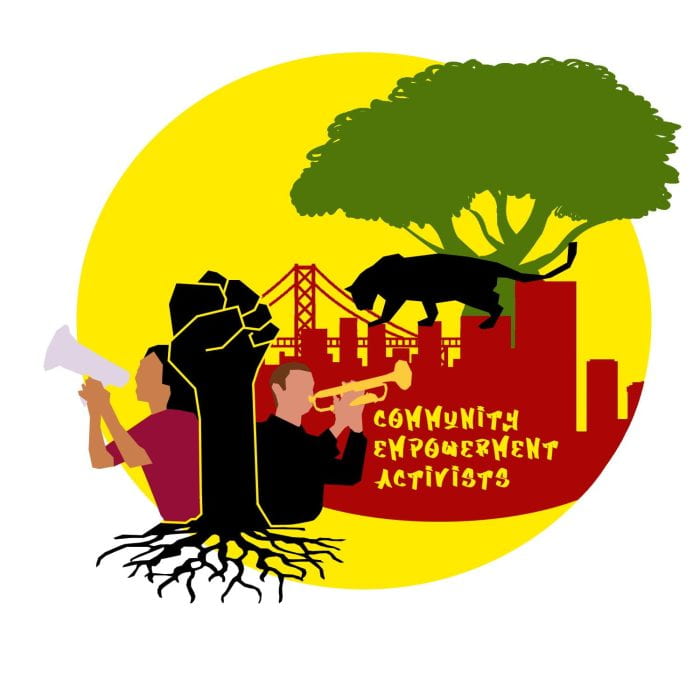
In this week’s blog, Sofia Criswell ’25 reflects on their journey creating the new Community Empowerment Activists (CEA) logo. With collaboration and creativity, Sofia was able to blend various components of diversity, community, Mother Earth, color, and joy in their artwork. Keep reading to learn about the artistic process and what the logo portrays.
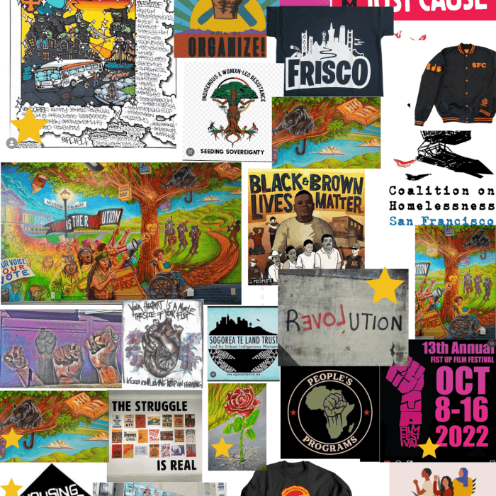
Reflecting back on the process behind creating our CEA logo, I can say it was truly a collaborative process. The logo took many forms and evolved along the way as Alaia, Jackie, Jaelyn and I refined how exactly we wanted to visually communicate CEA’s values and goals. Jackie set the tone for the logo by creating a mood board where she pulled different inspirations for me to build off of, and this was extremely helpful in setting me on a cohesive path. Early on, we also discussed our desire to stray from making the logo abstract. After all, CEA is grounded in real-world work and connections rather than just theory.
This is CEA—diversity, community, Mother Earth, color, and joy.
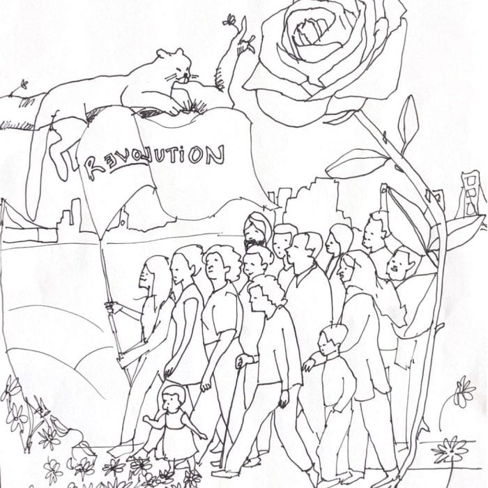
I had initially jumped into designing by strictly using my computer. After a few iterations, I realized I felt no connection to the illustrations when they were confined to my computer. I broke out of the digital landscape and began sketching. This is when I felt my heart was into the design. After switching to an analog process, the logo developed naturally and by the end, I think we were all very happy with the final product.
This is CEA—diversity, community, Mother Earth, color, and joy. Folks from all walks of life come together to walk in the movement for the just world we want to see. Each element within the design was chosen with intention and represents a facet of CEA. The black panther represents how we pay respects to those that came before and in return they watch over us. The “Rose Outta Concrete” pays homage to the rapper, Tupac and represents the importance of cultural wealth in the movement. The flag held by the comrade in the front reads, “rEVOLution.” Within CEA we understand that the real revolution is fought with collective love. Liberation is love. Finally, San Francisco sits in the background. This is the land we lay our feet on, organize in, and where we continuously choose love.
It was a joy to create this visual representation and logo for CEA. It challenged me to continuously rethink how to illustrate the fight for liberation and work with a team of diverse individuals. I am honored to have been given this opportunity.
Learn more about the Community Empowerment Activists program here.


