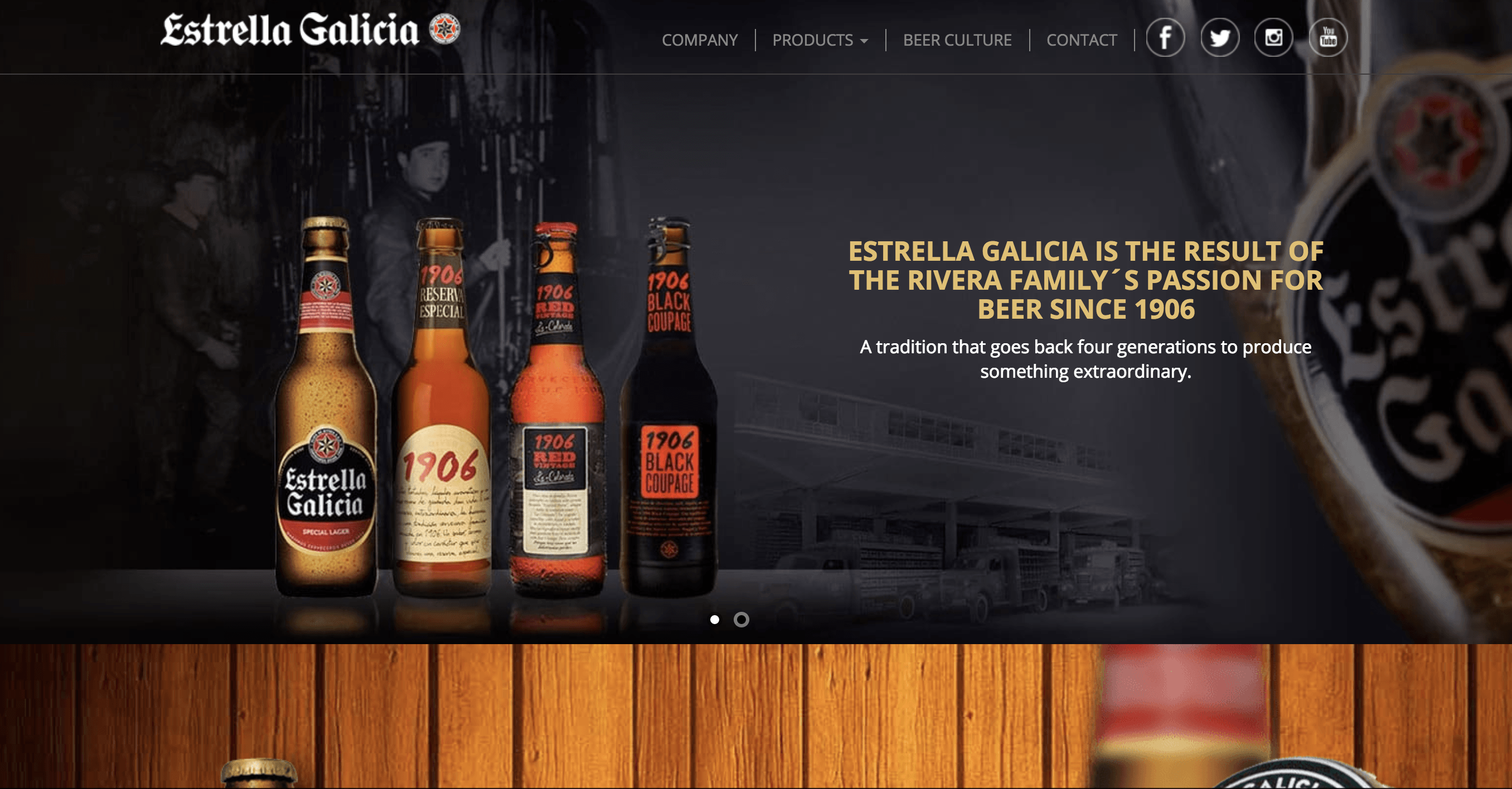
The website screenshot here below is for an extremely popular brand of beer, Estrella Galicia, local to the Northwest providence of Spain where my Father is from called Galicia. I was surprise to find that they have a US website, because I assumed they were only local to Spain/Europe. Clearly then they are trying to accommodate and appeal to the beer scene in the US. Specific to linguistics and cultural communication design, they are particular earnest in relaying to their audience about generation and tradition in the formation of their brand. The design of their packaging is very reminiscent of traditional german branding for beer… which I’m not sure if that’s intentional or not. The website is definitely trying to give a familiar feel to their international audience and that’s why their use of german-esque branding font and colors, and even this idea of their brand cultural being generational, is definitely used effective if they are trying to appeal to that market.
They are also certainly trying to cultivate a reverence to the high brow/elitist branch of beer culture by diving into special depth, right on their home page, about the intricacies of all their special beers… where to the regular beer drinking may know really nothing about. They also endorse/showcase a mineral bottle company that I see everywhere and is huge in Galicia called Cabreiroa, which I find interesting also… because I’ve never seen this brand anywhere in the US.
Leave a Reply