
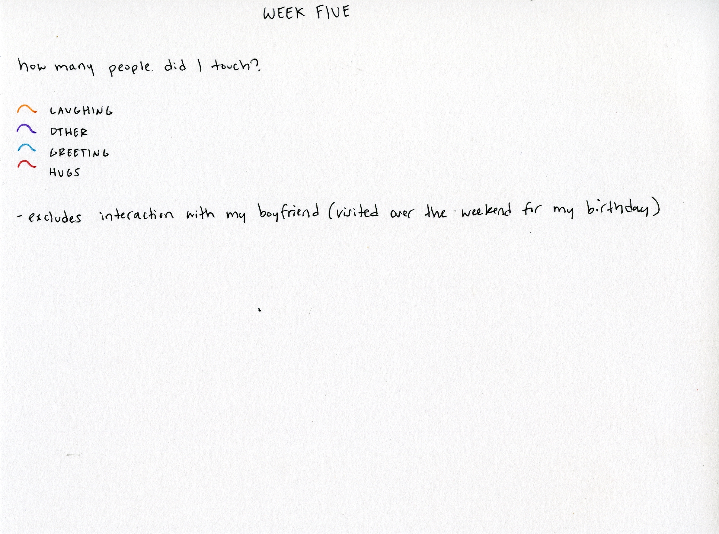
The USF Design Program welcomed professors Adrien Segal and Scott Kildall to co-teach the Information Visualization course for the Fall 2017 semester. We asked them three questions to introduce themselves and welcome them to the Design program!
What are your career backgrounds and how do they relate to information visualization?
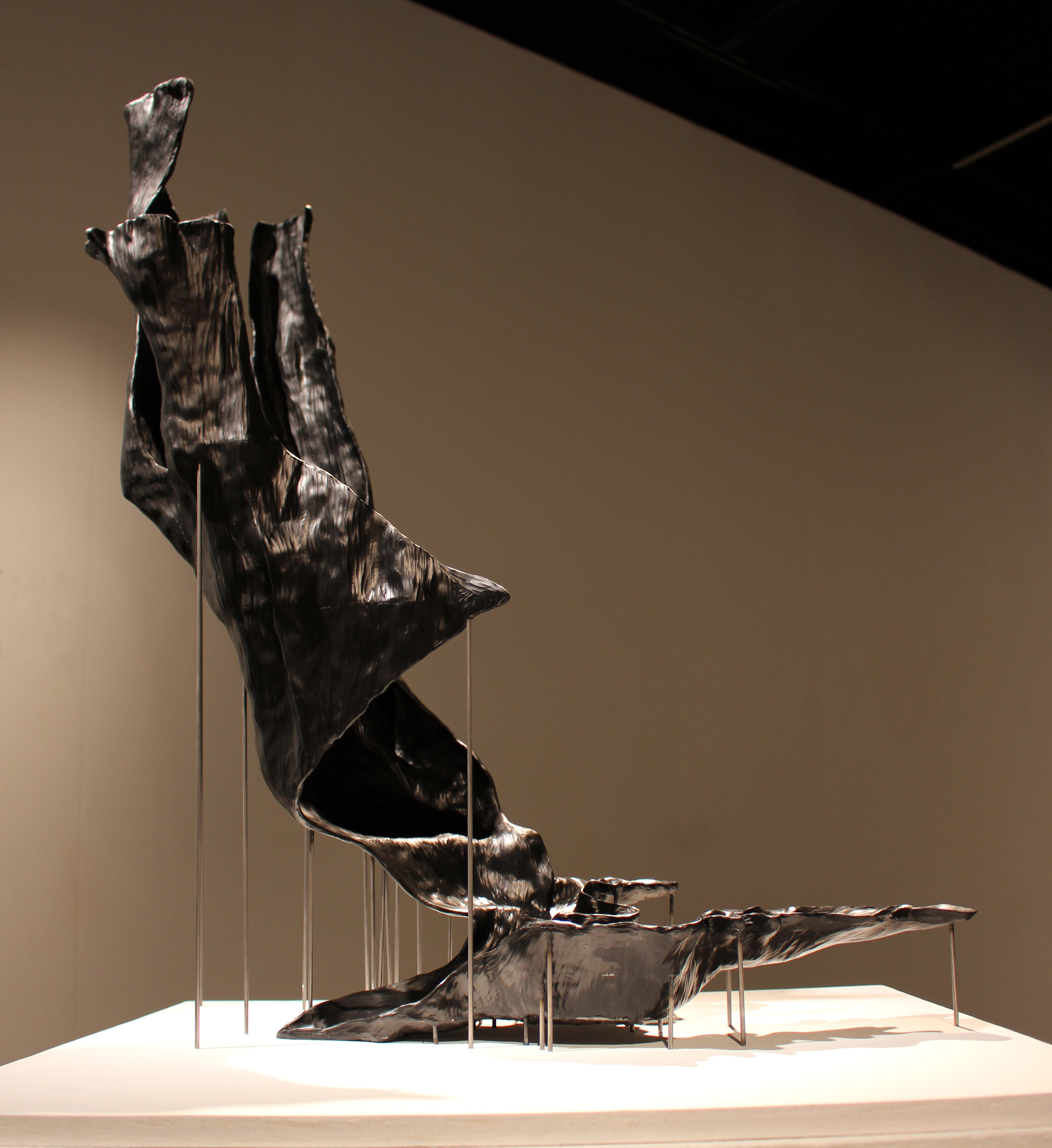
Professor Adrien Segal’s Wildfire Progression
Adrien Segal: I’m an artist working primarily in the medium of sculpture. Sculpture is the means by whichI reconcile conventions of reason and fact with an intuitive and emotive experience. I research and incorporate data into my sculpture as a way to make information accessible in unexpected visual and physical forms. Much of my work has been focused on revealing changes in the landscape and trends related to water or the lack there of.
Scott Kindall: In my 20s, I was trained as a software developer, who worked in developing educational software such as learning tools. And, in my early 30s, I finished an M.F.A. program at the School of the Art Institute in Art + Technology Studies.
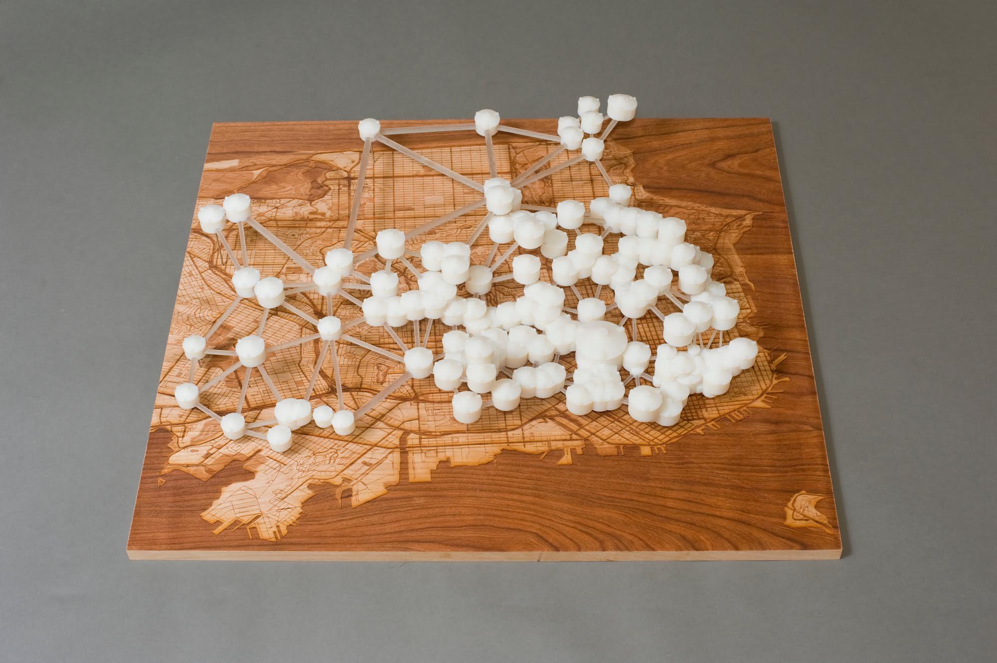
Professor Scott Kildall’s Water Works: San Francisco Cisterns
My transition into Information Visualization was formalized several years ago, when Iworked as a New Media Exhibit Developer at the Exploratorium (2012-13), where I was hired to help code and design exhibits, which included both screen-based and physical data-visualizations related to marine life. Here, learned from hands-on experience how to work with a general audience and engage them with principles of learning. After working at the Exploratorium, I have been working with the Pier 9 Autodesk Creative community, first as an artist-in-residence and now as a member of the shop staff. With access to their amazing digital fabrication machines, I have been continually creating artwork which includes information visualization related to the natural sciences such as water quality and meteorite impacts. And in the meanwhile, I’ve been always focused on education and learning, so teaching this course ties into my career trajectory very well.
How has the experience been working as co-teachers of the course?
AS: Co-teaching with Scott has been amazing and beneficial for all involved as it allows each of us to continue to pursue our individual professional creative practices while also being able to teach, which can be at odds. Scott and I have very different technical skill sets, which gives the students exposure to varied approaches to the field of data visualization, as well as different resources for a variety of skills and more dynamic critical feedback.
SK: It’s been great! I’ve known Adrien through the Pier 9 community and have been a guest lecturer in some of her previous classes. We share a love of physical artworks and of water. While I have a more technical background than her, she brings a conceptual focus that has helped me be a better teacher and so I’ve learned so much by working alongside her. We’ve been actively consulting on the syllabus and assignments, which has been both challenging because we’re packing a lot in the course and fun because she’s smart and great to work with.
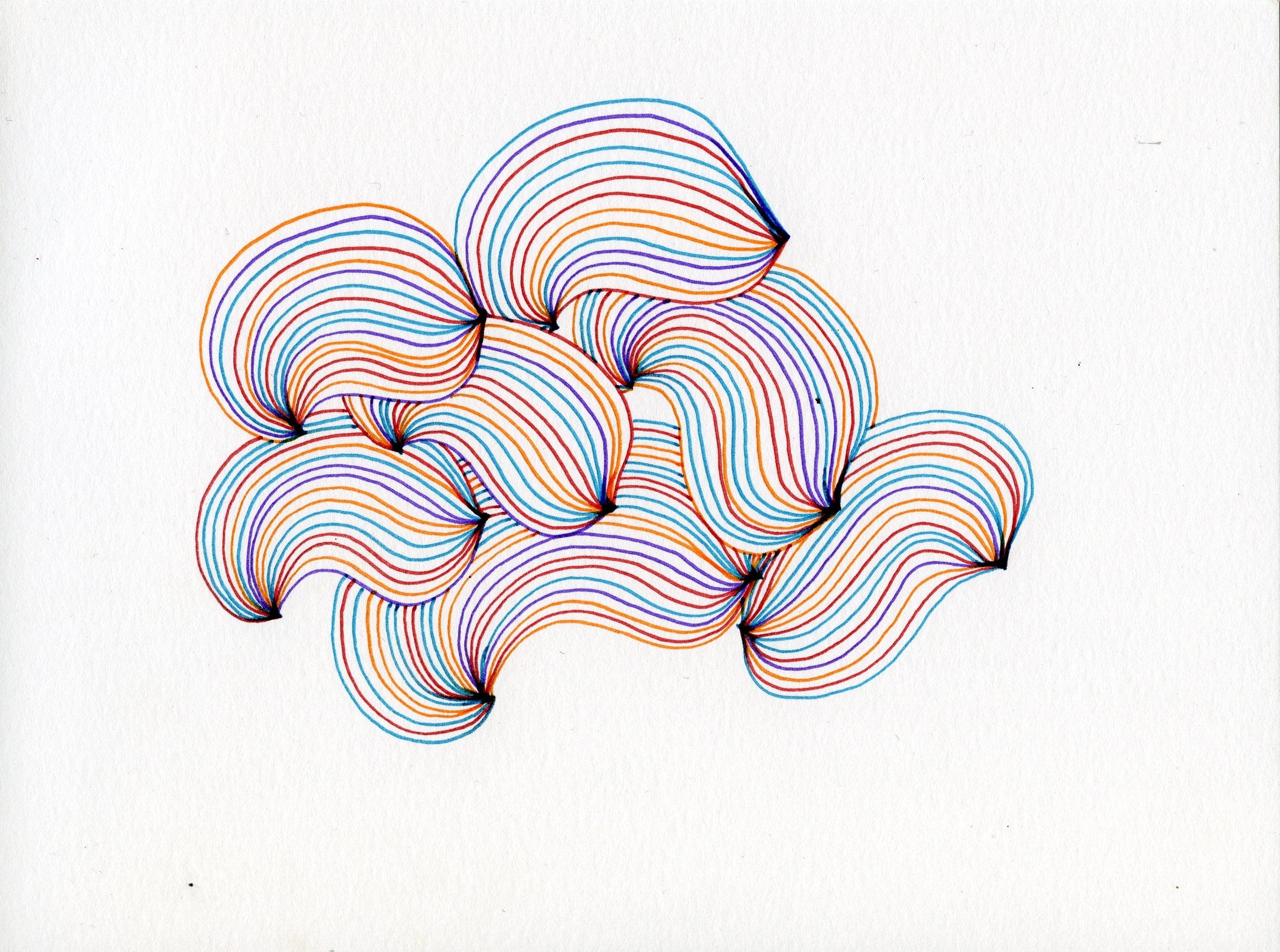
Senior Desirée Dinh’s visualization for Information Visualization’s Dear Data project.
How do you feel Information Visualization relates to social Change?
AS: There is great value and power in information visualization to express a point of view, create a narrative, make social commentary, augment understanding, or facilitate persuasion, and ultimately, help us reveal and understand the world around us in ways that the naked eye cannot see.
As visual artists and designers, having the tools and skills necessary to reveal insights through a creative lens is a way to deepen engagement with meaningful social issues and to share that knowledge effectively with a broad audience, so that new narratives and meanings can be formed.
SK: Wow, this is a big question. A huge component of Information Visualization in the general sense is about effective visual storytelling using data. A lot of data surrounding social change such as climate issues, economic inequality, racism and so much more feel overwhelming and are difficult to engage with the public. For example, there is a huge difference between rises in 1.5°C and 2.0°C of global temperatures in terms of climate change. But, this has little impact on people’s psyche because these numbers have no emotional resonance. However, a data visualization, for example, where you can see coastlines getting submerged in water has a huge impact because you can see the visual effects of data.
Used properly, Information Visualization is an amazing way to bridge specific domains of knowledge with a general public understanding. Even though it’s a popular field, it is still in its early stages. As we gain more access to larger sets of data, it will be up to the designers to interpret that data and incumbent upon them to leverage social change that speaks to that data. And so, students going into this field have both the power and responsibility to be aware of social issues, be culturally sensitive and finally to be forward-thinking.
