As any parent in San Francisco knows all too well, enrolling your would-be kindergartener in the San Francisco Unified School District (SFUSD) system is a daunting process. The challenges include countless tours that often “sell out” and each last an hour or more. These tours culminate in showing up at the SFUSD office for an in-person paper application process that has taken at times over 3 hours to complete and makes the DMV look like a well-oiled machine by comparison. Parents largely suffer this time-consuming process out of love for their child but it is harder to imagine a more frustrating and anxiety ridden process to have your child attend kindergarten.
The single largest source of parental anxiety related to this activity is the amount of random chance in the process. While we won’t review the lottery process in all its glorious detail, the process boils down to this: Each parent applies and ranks a large number of SFUSD kindergartens, each with an abysmally low probability, and hopes that one or more coins comes up heads. The highest-ranked winning pick (if a winning event actually occurs) is awarded to the kindergartener. Again, the process is more complicated than we have described and includes complex tie-break systems, as well as language categories bucketing, but ranking and low probability coin flipping is an essential feature of the process.
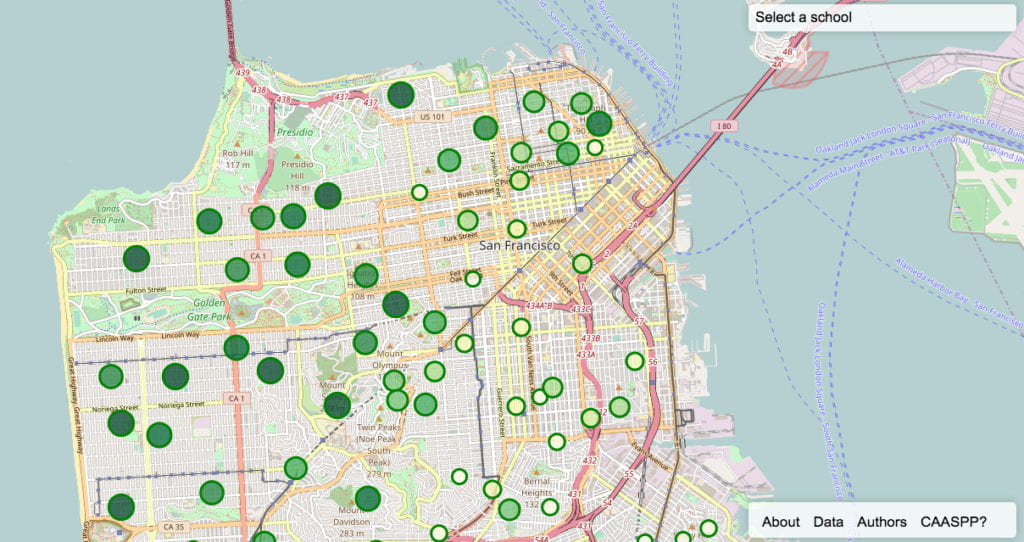
The information provided by the SFUSD is neither user friendly nor capable of easy digestion to help parents make informed decisions. In response to this, second year Analytics Assistant Professor Yannet Interian created the visualization tool using leaflet, a java script library for interactive maps, to help parents navigate the complex application process by providing a brief but informative snapshot of each of the 72 schools in the system.
“I have a 2-year old and I thought about what information I would want to help navigate the complex application process. Putting all the relevant data together in a clear and easy to read format can help parents figure out how to rank schools more efficiently,” said Professor Interian.
She sorted through some of the information available about each school to identify the schools in high demand but also highlight how difficult and challenging it is to attend the best schools in San Francisco. After choosing a few set parameters such as number of applications, number of available seats and California Assessment of Student Progress and Performance (CAASPP) scores, they developed a simple visualization system to understand the landscape of elementary schools plotted directly onto a city map of San Francisco. Professor Interian teamed up with software engineer Morgan Whitmont to build the first version of this prototype site.
While many “metrics” of school quality exists, Professor Interian developed a simple localized SF ranking using CAASPP Math and English scores, with the formula included in the visualizaiton. While more comprehensive measures of the health of a school than these two exist, for this first go around Interian and Whitmont created a data visualization tool that provides a partial — but important — overall picture of each school. One of the most important but depressing figures easily found by scrolling over each school is the percentage of applications that were accepted. For example, at Grattan Elementary, 1446 applicants vied for 65 open seats in kindergarten which is reported as 4.5%. Sadly, the actual probability of applying and getting into Grattan for many parents is vastly lower once you factor in the tie-breaking system and it is likely sub 1% in the last round of the tie break.
Interian and Whitmont look forward to receiving feedback from SF parents on how to improve the visualization so that it becomes an essential tool in understanding the elementary school landscape. They have plans to incorporate diversity statistics as well as other metrics of the health of the school in future versions. In addition they would like to further separate and add to the visualization the different language tracks at the schools that have them. For now, Interian and Whitmont hope the visualization allows parents to move forward armed with the information needed to make an informed, (slightly more) confident decision about their children’s education.